Not all housing markets are the same, particularly in their path to recovery since the housing market bubble popped almost a decade ago. Measuring the severity and duration of collapse by market and the amount of price recovery to date reinforces that not all housing market recoveries are created equal. Some markets are already better off than before, while others still have a long way to go. Real estate, after all, is a local phenomenon.
“The relationship between the severity of the house price decline and the distance from recovery is crucial to understanding why some markets have yet to bounce back.”
The graph below shows the relationship between the amount of decline in prices from the market peak in 2005 and the level of current prices relative to the market peak in 2005 for the largest metropolitan areas in the country. Markets with big crashes that have not yet returned to their prior peak are toward the lower right corner. Markets that had mild or non-existent price crashes, whose current prices have already moved above the 2005 peak, are toward the upper left. Market circles are sized based on population and are colored based on the most recent year-over-year appreciation rate. You can also view an interactive graph, where you can find details for your own market.
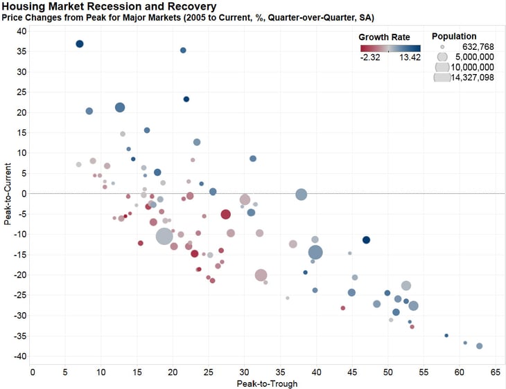
The downward sloping trend implies that metropolitan areas that “busted” are still struggling to regain all that was lost. It’s also apparent that those metropolitan areas with lower growth rates are more likely to be currently below their peak values, and are less likely to have had a big bust.
So, why does the relationship between the severity of the house price decline and the distance from recovery matter? Because it is crucial to understanding why some housing markets have yet to bounce back. The markets with the steepest declines in price are also the markets that continue to struggle with insufficient equity and pent-up supply. Consider, for example, Las Vegas, shown by the lowest point in the right-hand corner of the graph. Once the poster child for real estate mania, Las Vegas is now a city that remains well below its bubble-peak. Even though it is appreciating quickly now, it lost more than 60 percent of the peak market value at its low point in the collapse. That means that many homeowners remain in negative or insufficient equity position. It’s hard to be a homebuyer, if you can’t afford to be a home seller.
There is possibly even more truth today than in times past in the old real estate adage – location, location, location. Many of the mighty markets that drove the housing boom have yet to recover from deep losses in value. Yet other markets that barely experienced a house price collapse have already exceeded their price peak of a decade ago.
The consequence of incomplete recovery is pent-up supply and constrained market activity. For the housing market to achieve its full capacity nationwide, many markets will need to continue to improve. How low have the mighty fallen? Well, far enough that a full recovery is not yet completely achieved, but the good news is progress is being made.


